
Table of Contents
Graphical Representation and Mapping of Data are essential techniques that contribute to the effective communication and analysis of information in various fields. Both of these techniques play a pivotal role in simplifying complex information and deriving valuable insights. Graphical Representation and Mapping of Data is a crucial part of UGC NET Paper I and it comes under the Data Interpretation section. This article will describe the types of graphical representation, the significance of data mapping, its benefits, and the challenges it poses.
UGC NET Study Notes for Paper 1
What is Graphical Representation?
Graphical Representation refers to the Representation of data in the form of graphs so that it is more attractive. It simplifies complex information, making it easier to understand, analyze, and communicate. Graphical representations help identify patterns, trends, and relationships in data. They enhance data comprehension, aid decision-making, and enable effective communication of insights.
Types of Graphical Representation of Data
In the following section, the Type of Graphical Representation of Data is examples in detail. Read and learn about the nuances and usages of each and every type of Graphical Representation of Data.
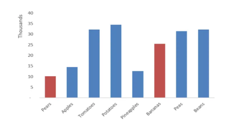
Bar Chart
- A bar chart uses rectangular bars to represent data values. It is commonly used to compare discrete categories or show the distribution of a single variable.
- The length of each bar corresponds to the value it represents.
- Bar charts are particularly useful for displaying categorical or non-continuous data.
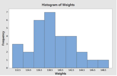
Histogram
- A histogram is a graphical representation that displays the distribution of a continuous variable.
- It consists of a series of bars, where the width of each bar represents a range of values, and the height represents the frequency or count of data points falling within that range.
- Histograms are especially useful for visualizing the shape, range, and frequency of data.
 Pie Chart
- A pie chart is a circular graph divided into sectors, with each sector representing a proportion or percentage of the whole.
- Pie charts are commonly used to show the composition or distribution of categorical data.
- The size of each sector corresponds to the relative proportion it represents.
- Pie charts are effective for displaying data with a limited number of categories and are often used to represent survey responses, market shares, or budget allocations.
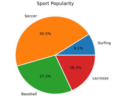
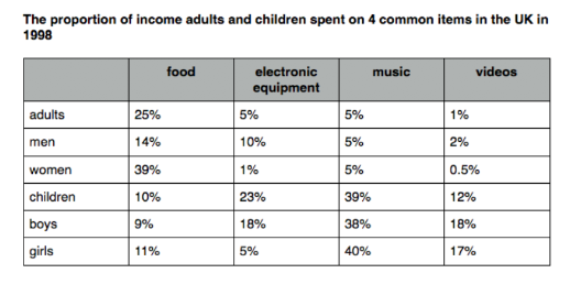
Table Chart
- A table chart presents data in a tabular format, typically using rows and columns.
- It is a structured way to display detailed information and can include numerical values, text, or both.
- Table charts are highly versatile and allow for precise data representation, making them suitable for organizing and comparing data across different dimensions or variables.
- They are commonly used in reports, research papers, and data summaries.
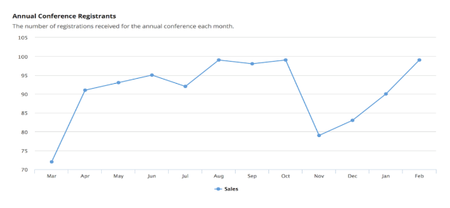
Line Chart
- A line chart displays data as a series of data points connected by lines.
- The x-axis typically represents time or another continuous variable, while the y-axis represents the corresponding values.
- Line charts help visualize the relationship between variables and identify patterns, fluctuations, or changes over a given period.
- They are commonly used in financial analysis, stock market trends, and scientific data representation.
Mapping of Data
Mapping of data refers to the process of establishing relationships or connections between different data elements or attributes. It involves defining how data from one source corresponds or relates to data in another source, enabling integration, analysis, or visualization of the data.
In simpler terms, data mapping is like creating a bridge between two or more datasets, ensuring that the corresponding information aligns correctly. It helps ensure compatibility and consistency when working with data from diverse sources or formats.
For example, imagine you have a spreadsheet with customer information, including names, addresses, and phone numbers. Now, you receive a new dataset from another system that includes customer IDs, email addresses, and purchase history. To combine and analyze these datasets effectively, you need to map the customer IDs from both sources, establishing a connection between the customer information and purchase history.
By mapping the data, you can link the customer IDs from the first dataset to the customer IDs in the second dataset. This mapping allows you to create a unified view of the customer data, integrating information like names, addresses, phone numbers, email addresses, and purchase history. Now, you can analyze this combined dataset to gain insights into customer behaviour, segment customers, or personalize marketing campaigns.
Data mapping is a fundamental process in data integration, analysis, and visualization. It helps ensure that data from different sources can be effectively merged, related, and utilized to gain meaningful insights and make informed decisions.
Benefits of Mapping Data
Check out the Benefits of Mapping Data with the help of a graphical representation.
- Data Integration: Allows for the integration of data from diverse sources, creating a unified view.
- Consistency and Accuracy: Ensures standardized and reliable data by aligning elements.
- Improved Data Analysis: Identifies relationships and patterns between datasets for meaningful insights.
- Enhanced Decision-Making: Enables informed, data-driven decision-making based on comprehensive data.
- Efficient Data Migration: Smooth and accurate transfer of data between systems or databases.
- Data Visualization: Provides a foundation for effective visual representation of complex information.
Challenges of Mapping Data
Along with the Benefits, Data Mapping also poses some challenges. Stated below are the various challenges of mapping data.
- Data Inconsistencies: Varying formats and structures make mapping complex.
- Complex Data Transformations: Handling intricate data transformations is challenging.
- Mapping Complexity: Large attribute sets or complex relationships pose challenges.
- Lack of Standardization: Non-standardized schemas make mapping difficult.
- Scalability: Handling large data volumes requires efficient processing.
- Data Security and Privacy: Ensuring data protection during mapping is crucial.
Download Graphical Representation and Mapping of Data Study Notes PDF
| UGC NET Important Links | |
| UGC NET 2023 Notification | UGC NET New Syllabus |
| UGC NET Previous Year Papers | UGC NET Study Notes for Paper 1 |


 UKMSSB Recruitment 2026 Out, Apply Onlin...
 KGBV Recruitment 2026 OUT for 32 Vacanci...
 NFSU Gandhinagar Contractual Faculty Rec...