Correct option is A
A contingency table, also known as a cross-tabulation table, is a statistical tool used to analyze the relationship between two categorical variables. It is structured in a matrix format with rows and columns, where each cell represents the frequency of occurrences corresponding to a combination of categories from both variables.
For example, in a survey analyzing gender (Male/Female) and preferred social media platform (Facebook/Instagram/Twitter), a contingency table would look like this:
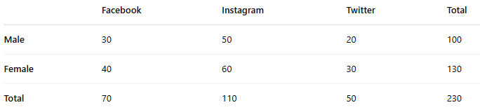
The rows (e.g., gender) and columns (e.g., social media platform) represent the two categorical variables, and the numbers inside the table indicate the frequency of occurrences.
Key Features of Contingency Tables:
Used for categorical (qualitative) data.
Helps in analyzing relationships between two variables.
Basis for statistical tests like Chi-Square Test for Independence.
Useful in market research, medical studies, and social sciences.
Information Booster:
Contingency tables organize categorical data into a matrix of rows and columns.
They help identify patterns and relationships between two categorical variables.
Used extensively in statistics, machine learning, and data analysis.
Supports statistical tests like the Chi-Square Test to determine variable dependency.
The marginal totals represent the sum of observations for each category.
Larger contingency tables (e.g., 3×3 or 4×4) analyze more complex categorical relationships.
Additional Knowledge:
(b) Summarizes the number of measurements which are less than the upper-class boundary of each class
This describes a cumulative frequency distribution, which records the total count of observations falling below each class boundary in a dataset.
It is commonly used in histogram analysis and cumulative frequency graphs.
Example: If scores in an exam are grouped into class intervals (0-10, 11-20, etc.), the cumulative frequency at 20 includes all students scoring ≤ 20.
(c) Summarizes the percentage of items (or measurements) in each of several non-overlapping classes
This defines a relative frequency distribution, which expresses frequencies as percentages rather than absolute counts.
Helps in comparing datasets with different sample sizes.
Example: If 20 out of 100 students score between 70-80 marks, the relative frequency is 20%.
(d) Displays points representing each class frequency above their class midpoints
This describes a frequency polygon, a graphical representation of a histogram using points connected by lines.
Each point is plotted at the class midpoint with a height proportional to the class frequency.
Example: A frequency polygon for test scores plots the number of students per score range, helping visualize distribution trends.
 English
 10 Questions
 20 Marks
 12 Mins