Correct option is C
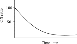
The correct answer is: 3.
Explanation:
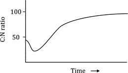
The C:N ratio (Carbon to Nitrogen ratio) in decomposing leaf litter in temperate forests typically changes over time. As leaf litter decomposes, microbial activity increases, and nitrogen is released. Initially, the C:N ratio is high due to the relatively high carbon content in fresh leaf litter. Over time, as decomposition progresses, nitrogen is mineralized and released into the soil, and the carbon content decreases, lowering the C:N ratio. This is represented by a graph that shows a decline in the C:N ratio over time, as seen in graph 3.
Graph 3 accurately shows the typical pattern of the C:N ratio decreasing over time, reflecting the release of nitrogen and the breakdown of carbon during the decomposition process in temperate forests.
Information Booster:
High C:N ratio in fresh leaf litter is due to the high carbon content relative to nitrogen.
As decomposition occurs, microbial organisms consume carbon and release nitrogen, leading to a decrease in the C:N ratio.
The mineralization of nitrogen from organic matter is a key process in the nutrient cycling of temperate forests.
The C:N ratio stabilizes at a lower level as the decomposition reaches equilibrium and the organic matter becomes more humus-like.
A high C:N ratio in litter can slow down decomposition because microbes require more nitrogen for efficient breakdown.
Additional Information:
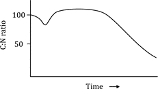
Graph 1: This graph shows an increase in the C:N ratio, which is atypical for decomposition processes in forests.
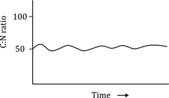
Graph 2: This graph shows a relatively stable C:N ratio over time, which does not reflect the typical decrease during decomposition.
Graph 4: This graph shows a constant C:N ratio, which is not typical as the C:N ratio usually decreases as nitrogen is released during decomposition.