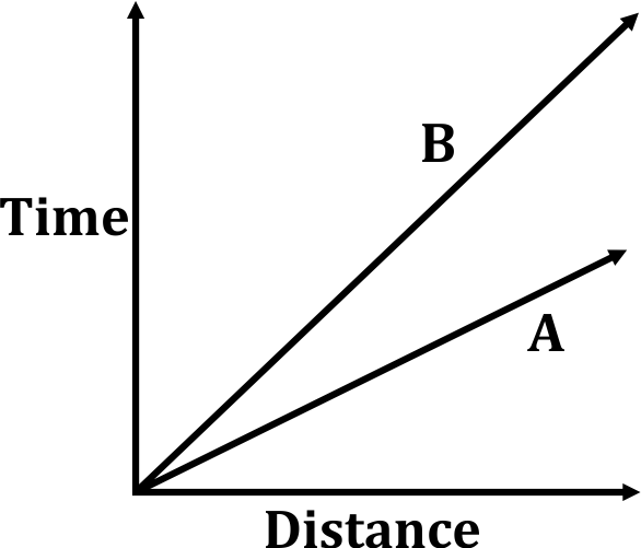
Correct option is D
Solution:
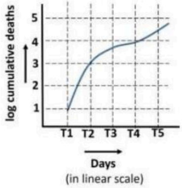
graph shows:
·
Y-axis: Log of cumulative deaths
·
X-axis: Days (T1 to T5, equal intervals)
·
Curve is logarithmic, so equal vertical spacing means multiplicative increase in actual numbers
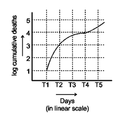
The Graph shows that,
The number of deaths increased slowly from T1 to T4, but the
number of deaths increased largest during T4 & T5.
∴ The correct answer will be T4 to T5