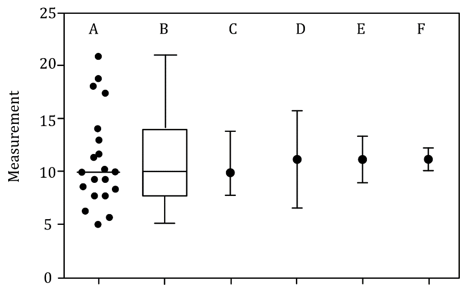
arrow
arrow
arrow
​The figure given below represents the same data in six different ways. 'A' represents the scatter plot of all data points and 'B' is its correspondin
Question

The figure given below represents the same data in six different ways. 'A' represents the scatter plot of all data points and 'B' is its corresponding box and whisker plot. 'C' to 'F' represent the same dataset with different measures of central tendency alongside various measures of variation (SEM - Standard Error of Mean, SD - Standard Deviation, CI - 95% confidence interval).

Which one of the following options is a correct representation of the data?

A.

C = Mean ± quartiles; D = Median ± SEM; E = Median ± CI; F = Mean ± SD

B.

D = Mean ± SD; E = Mean ± CI; F = Mean ± SEM

C.

C = Median with quartiles; D = Mean ± SEM; E = Mean with CI; F = Mean ± SD

D.

D = Mean ± SEM; E = Mean with CI; F = Mean ± SD

Correct option is B

Detailed Explanation:

  1. Plot C = Mean ± SD (Standard Deviation):

    • The error bars in plot C represent the variability of the data using the standard deviation.

    • SD reflects the spread of data around the mean, showing how dispersed the data points are.

    • It is typically larger than SEM, so plot C’s error bars are expected to be relatively wide.

  2. Plot D = Mean ± SEM (Standard Error of the Mean):

    • SEM measures how precisely the mean has been estimated from the sample.

    • SEM bars are generally smaller than SD bars because SEM = SD / √n (sample size).

    • Plot D shows narrower error bars than plot C, consistent with SEM representation.

  3. Plot E = Mean ± CI (95% Confidence Interval):

    • CI indicates the range within which the true population mean is likely to fall with 95% confidence.

    • CI bars tend to be wider than SEM but can overlap with SD depending on sample size and distribution.

    • Plot E shows moderately sized error bars matching this description.

  4. Plot F = Mean ± SEM:

    • Similar to plot D, plot F shows mean with SEM as error bars.

    • This can happen when different methods or presentations use SEM for clarity or comparison.

 Option 2 is Correct:

  • All plots C to F represent the mean as the central tendency, not the median.

  • Error bars vary in size logically according to the measure used (SD > CI > SEM).

  • Both D and F represent Mean ± SEM, which can occur if the data is displayed with repeated SEM plots for comparison or clarity.

Similar Questions

test-prime-package

Access ‘CSIR NET Life Sciences’ Mock Tests with

  • 60000+ Mocks and Previous Year Papers
  • Unlimited Re-Attempts
  • Personalised Report Card
  • 500% Refund on Final Selection
  • Largest Community
students-icon
354k+ students have already unlocked exclusive benefits with Test Prime!
Our Plans
Monthsup-arrow